PoshUI Components
Danger Alert
Info Alert
Primary Alert
Secondary Alert
Success Alert
Warning Alert
Avatars
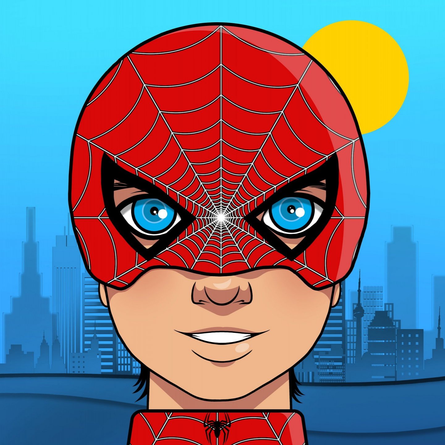
Different Sized Avatars
Badge on Icons
Badge on Avatars
Filled Primary Buttons
Outlined Primary Buttons
Link Button
Icon Button
Floating Button
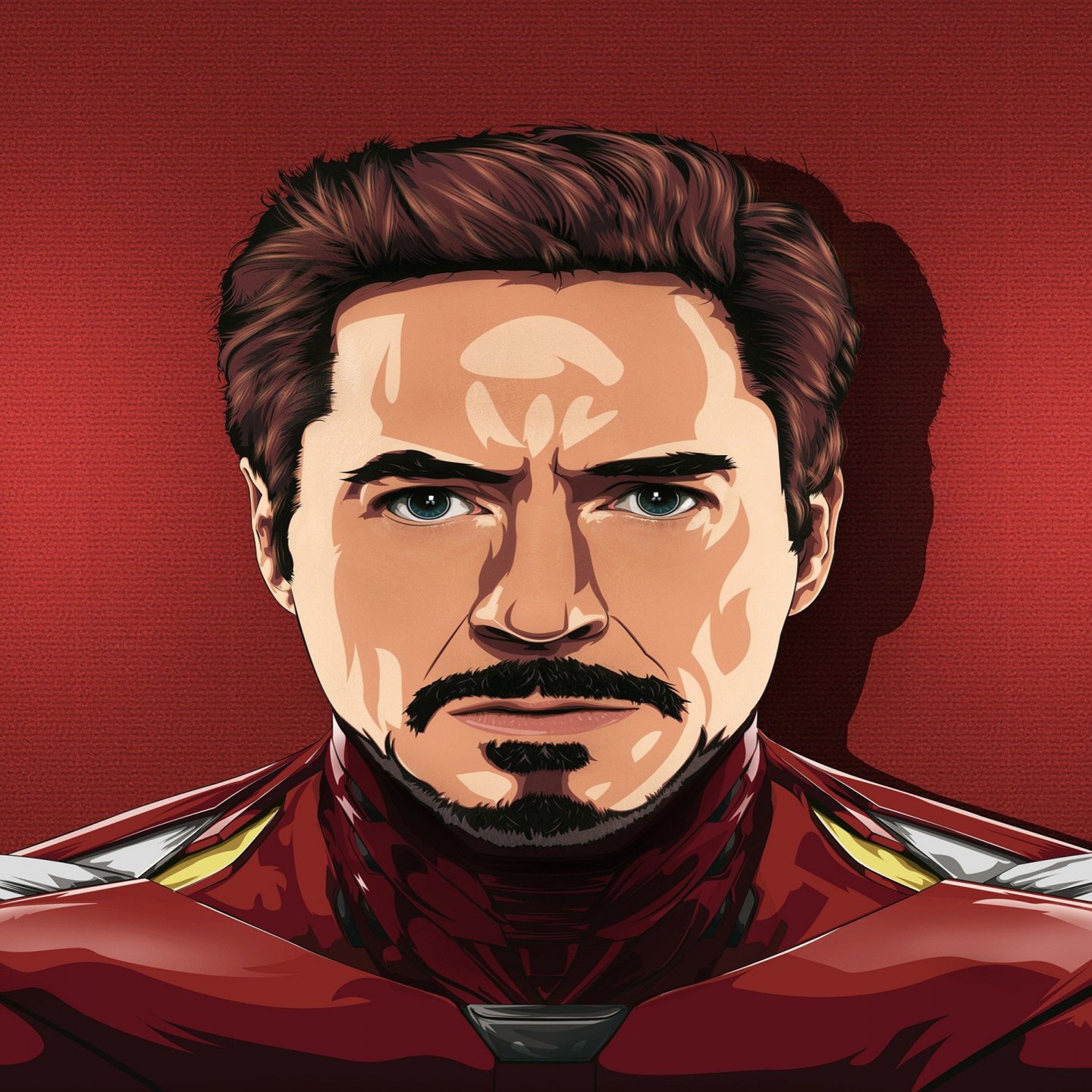
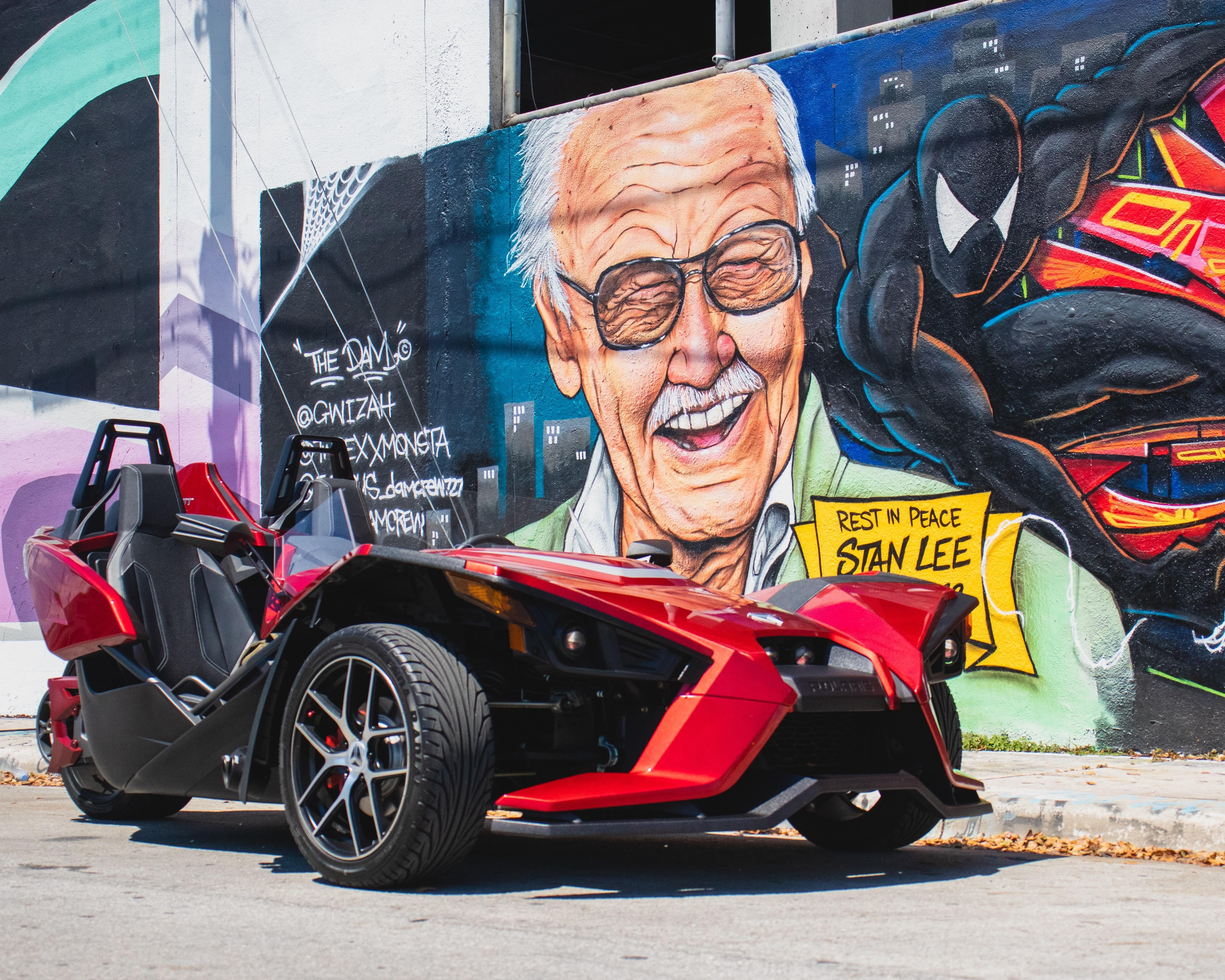
Horizontal Text Card
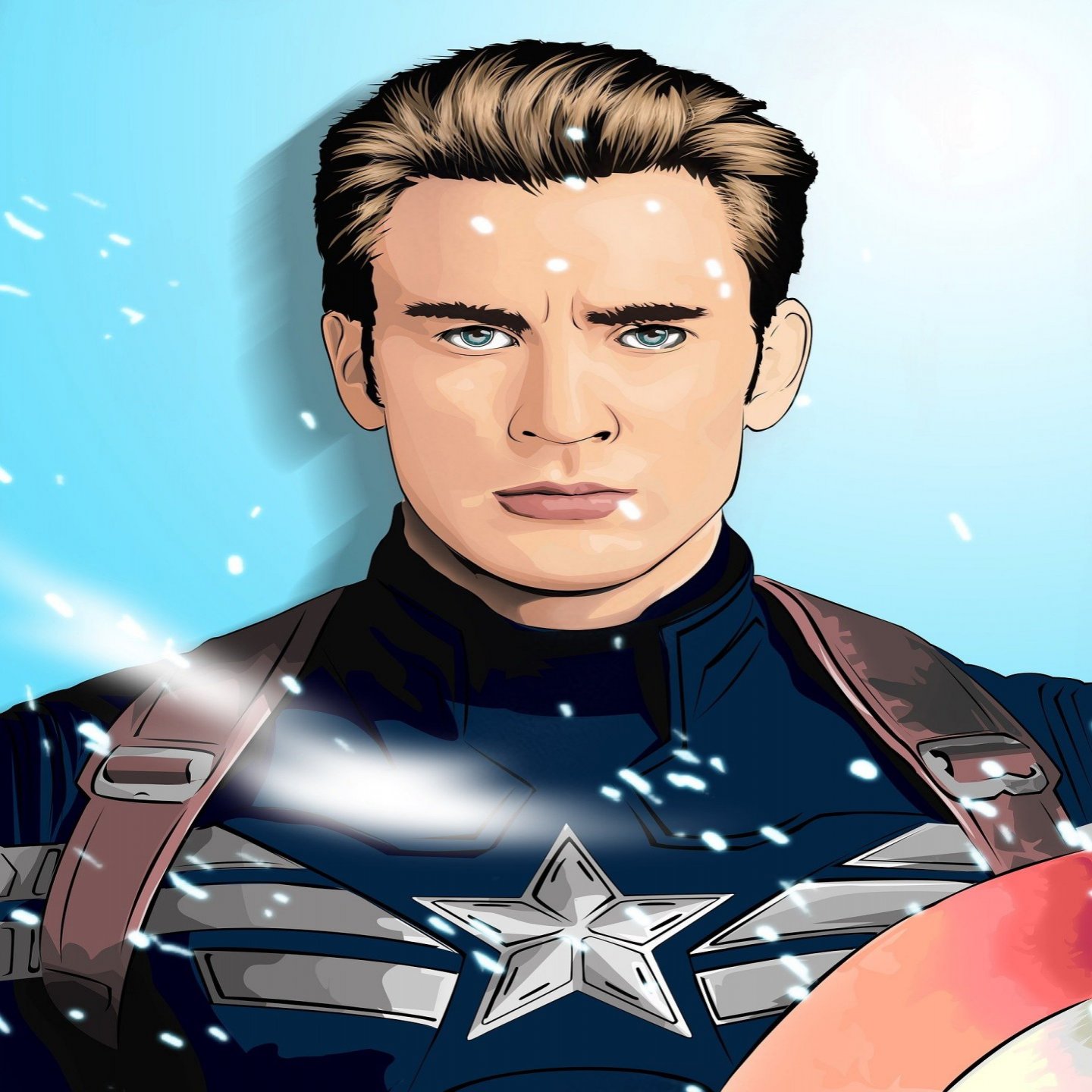
Captain America
Lorem ipsum dolor sit amet, consectetur adipiscing elit, sed do eiusmod tempor incididunt ut labore et dolore magna aliqua. Ut enim ad minim veniam, quis nostrud exercitation ullamco laboris nisi ut aliquip ex ea commodo consequat.
Vertical Item Card
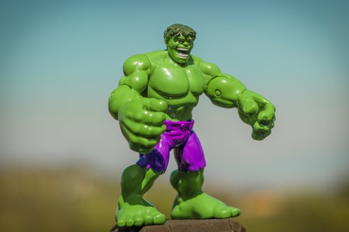
Hulk Bobblehead
Elegant Lifestyle Super Hero Incredible Hulk Action Figure Limited Edition, Marvel Comics Character
Text Overlay Card
You can hover to see overlay transition


Marvel Studios' Eternals | Final Trailer
Marvel Entertainment
Dismiss Card with Shadow
Marvel Heading
Lorem ipsum dolor sit amet, consectetur adipiscing elit, sed do eiusmod tempor incididunt ut labore et dolore magna aliqua.
Round Image

Square Image
Responsive Image
Resize your browser window, to see its responsiveness.
Text area
Form Input
Error Form Input
Two Columns Grid
Two Rows Grid
Three Columns Grid
Three Rows Grid
Ordered List
- List Item One
- List Item Two
- List Item Three
- List Item One
- List Item Two
- List Item Three
- List Item One
- List Item Two
- List Item Three
- List Item One
- List Item Two
- List Item Three
Unordered List
- List Item One
- List Item Two
- List Item Three
- List Item One
- List Item Two
- List Item Three
- List Item One
- List Item Two
- List Item Three
Category Checkbox List
Price Radio List
Notification Stacked List
Modal
Lorem ipsum dolor sit amet, consectetur adipiscing elit, sed do eiusmod tempor incididunt ut labore et dolore magna aliqua. Ut enim ad minim veniam, quis nostrud exercitation ullamco laboris nisi ut aliquip ex ea commodo consequat.
Modal Demo
Lorem ipsum dolor sit amet, consectetur adipiscing elit, sed do eiusmod tempor incididunt ut labore et dolore magna aliqua. Ut enim ad minim veniam, quis nostrud exercitation ullamco laboris nisi ut aliquip ex ea commodo consequat.
Desktop Variation One
Mobile Variation One
You can resize the browser width to see the hamburger in action
Filled Rating
Live Rating
Slider
Notification Toast
Hey! Now you can design your project faster and better with Posh UI
Notification Toast Demo
Hey! Now you can design your project faster and better with Posh UI
Stacked Notification Toast Demo
Tooltip Left
You can hover to see tooltip in action
Tooltip Right
You can hover to see tooltip in action
Alignment
Hey!👋 I am Left Aligned 😀
Hey!👋 I am Center Aligned 😀
Hey!👋 I am Right Aligned 😀
Display
Extra Small Posh UI
Small Posh UI
Medium Posh UI
Large Posh UI
Extra Large Posh UI
Extra Extra Large Posh UI
Headings
h1. Posh UI heading
h2. Posh UI heading
h3. Posh UI heading
h4. Posh UI heading
h5. Posh UI heading
h6. Posh UI heading
Inline text elements
I am the small text😐They colored me 😔 in gray
You can see the text-decoration:overline
You can see the text-decoration: line-through
You can see the text-decoration: underline
Background
background: var(--COLOR-ADD-CART)
background: var(--COLOR-ADD-CARD-DARK)
background: var(--COLOR-AMBER-500)
background: var(--COLOR-LIME-200)
background: var(--COLOR-LIME-500)
background: var(--COLOR-RED-50)
background: var(--COLOR-RED-500)
background: var(--COLOR-SLATE-50)
background: var(--COLOR-SLATE-400)
background: var(--COLOR-STONE)
background: var(--COLOR-WHITE);
Hover to see background: var(--COLOR-ADD-CART-DARK)
Hover to see background: var(--COLOR-RED-500)
Hover to see background: var(--COLOR-SLATE-300)
Color
Amber
| Variable Name | Variable Value | Color |
|---|---|---|
| --COLOR-AMBER-200 | #fde68a | |
| --COLOR-AMBER-400 | #fbbf24 | |
| --COLOR-AMBER-500 | #f59e0b | |
| --COLOR-AMBER-600 | #d97706 |
Blue
| Variable Name | Variable Value | Color |
|---|---|---|
| --COLOR-BLUE-50 | #eff6ff | |
| --COLOR-BLUE-300 | #93c5fd | |
| --COLOR-BLUE-500 | #3b82f6 | |
| --COLOR-BLUE-800 | #1e40af |
Cyan
| Variable Name | Variable Value | Color |
|---|---|---|
| --COLOR-CYAN-50 | #ecfeff | |
| --COLOR-CYAN-200 | #a5f3fc | |
| --COLOR-CYAN-500 | #06b6d4 | |
| --COLOR-CYAN-600 | #0891b2 |
Glossy Blue
| Variable Name | Variable Value | Color |
|---|---|---|
| --COLOR-GLOSSY-BLUE-100 | #cfdef9 | |
| --COLOR-GLOSSY-BLUE-500 | #0d5be1 | |
| --COLOR-GLOSSY-BLUE-700 | #0a49b4 |
Gray
| Variable Name | Variable Value | Color |
|---|---|---|
| --COLOR-GRAY-500 | #6b7280 |
Lime
| Variable Name | Variable Value | Color |
|---|---|---|
| --COLOR-LIME-200 | #d9f99d | |
| --COLOR-LIME-500 | #84cc16 | |
| --COLOR-LIME-600 | #65a30d |
Overlay
| Variable Name | Variable Value | Color |
|---|---|---|
| --COLOR-OVERLAY | rgba(51, 65, 85, 0.5) |
Red
| Variable Name | Variable Value | Color |
|---|---|---|
| --COLOR-RED-50 | #fadddd | |
| --COLOR-RED-200 | #fecaca | |
| --COLOR-RED-500 | #ef4444 | |
| --COLOR-RED-600 | #dc2626 |
Shadow Light
| Variable Name | Variable Value | Color |
|---|---|---|
| --COLOR-SHADOW-LIGHT | rgba(149, 157, 165, 0.2) |
Slate
| Variable Name | Variable Value | Color |
|---|---|---|
| --COLOR-SLATE-50 | #f8fafc | |
| --COLOR-SLATE-300 | #cbd5e1 | |
| --COLOR-SLATE-400 | #94a3b8 | |
| --COLOR-SLATE-500 | #64748b | |
| --COLOR-SLATE-600 | #475569 | |
| --COLOR-SLATE-700 | #334155 | |
| --COLOR-SLATE-800 | #1e293b |
Stone
| Variable Name | Variable Value | Color |
|---|---|---|
| --COLOR-STONE-50 | #454444 | |
| --COLOR-STONE | #333 |
White
| Variable Name | Variable Value | Color |
|---|---|---|
| --COLOR-WHITE | #fff |
Yellow
| Variable Name | Variable Value | Color |
|---|---|---|
| --COLOR-YELLOW | #ffd814 | |
| --COLOR-YELLOW-600 | #f4cf13 |
Font Size
font-size: 1.2rem
font-size: 1.5rem
font-size: 1.6rem
font-size: 1.7rem
font-size: 2rem
font-size: 3rem
Font Weight
font-weight: 100
font-weight: 200
font-weight: 300
font-weight: 400
font-weight: 500
font-weight: 600
font-weight: 700
font-weight: 800
font-weight: 900
font-weight: bold
font-weight: bolder
font-weight: lighter
font-weight: normal
Text Color
color: var(--COLOR-GRAY-500)
color: var(--COLOR-LIME-500)
color: var(--COLOR-LIME-600)
color: var(--COLOR-RED-500)
color: var(--COLOR-SLATE-600)
color: var(--COLOR-SLATE-800)
Hover to See the Color